Modern Lighting Technologies and the Olympic Opening Ceremony

Tuesday, August 8, 2017

On August 7, 1977 I came to work for my late father. It wasn't like my first day working for him or the sign industry. As the grandson and son of sign company owners, I was cleaning the shop and wiring ballasts by the age of 12, but this was my new venture into the professional side of the business. Actually, I was between jobs in Oregon and decided I would come down to California to help my dad launch Bill Moore & Associates, returning to Oregon once we had things where he wanted. I sometimes joke that this has been the longest temporary job I've ever had.

Some people ask me how I could do the same thing for 40 years. I think there are two answers to that. First, there is an amount of family pride. My grandfather, Art Nelson, started up Nelson Neon in Richmond, CA in 1948, and my dad joined him in 1953, the year I was born. How could I ever give up on such tradition and reputation? Growing up in the sign business with my family has instilled a tireless work ethic, along with a great sense of pride. The other explanation for such longevity is that I learn something new everyday. The industry provides enough challenges and new opportunities that boredom is an unknown occupational characteristic.

At the age of 63, some people might be anticipating retirement. I more dread the prospect than relish it. Sure there are days that try my patience and stamina, but those are more often forgotten when faced with new challenges and accomplishments. Retiring at 65 really isn't in my chromosomes, but you never know what lies ahead, so I just don't really think about it. I'll know when the time is right. Until then, I'll pour my energy into Bill Moore & Associates and the clients we serve, because for me, excluding my kids and wife, that's what it's all about.

Skip Moore
Bill Moore & Associates President
Retail Sign Design & Graphic Consultants
Ideas to Identity

Friday, March 11, 2016

Photography in the Sign Business

Wikipedia says that “… the adage, ‘A picture is worth a thousand words’ refers to the notion that a complex idea can be conveyed with just a single still image. It also aptly characterizes one of the main goals of visualization, namely making it possible to absorb large amounts of data quickly”. Interesting enough, this adage was coined in 1911. Not much has changed in this regard, but the means and methods certainly have.

I have been in the sign business for a long while; as a shop brat, then stock boy, then, after completing college, the last 36 years with Bill Moore & Associates. We have all witnessed a lot of changes in the tools we use during that duration. One of the areas that has changed is in photography. Of all the tools we have to perform our work, perhaps the importance of photography is the most underappreciated.

Regardless of your niche in the sign industry, photography has probably played a part. Survey photos, shop photos, completion photos all provide valuable record keeping and an invaluable marketing advantage. Over the years, I’ve seen cameras go from simple Brownies, to the convenience of Polaroid Land and Instamatic cameras, to the emergence of more compact and user friendly 35mm single lens reflex cameras, to finally arrive at the present with sophisticated yet simple digital cameras. Today we can send photos from our cell phones for real time gratification.


The quality and purpose of the images produced have improved along the same curve. We have binders of black and white or faded color photos of projects competed in the early 60’s. We have curled and discolored Polaroid prints from the early 70’s. We have sleeves filled with Kodachrome slides from the 80’s and 90’s. Now we have gigabytes of computer memory dedicated to storing digital photos. I can sit at my desk and pull up a picture of any project at any stage, send or receive the same in an email. No film, no developing, no printing, no cost.


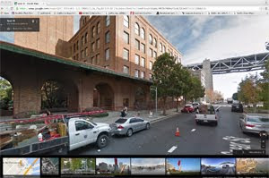
Of course, over the years, the expectation we have of photographs has matured as the tools have. Photos have taken on a far more prolific place in our day-to-day activities. We’re surrounded by visual images, not only at work on computer screens, but in our cars, on our phones, emails, publications and while browsing the web. Sites like Flickr , Facebook and Instagram have elevated photography to new levels of communication and quality. Software applications like Photoshop and Lightroom have given us the ability to manipulate an average picture into a spectacular picture, or even to a rendering of a proposed display. Google Earth allows us to visit remote sites and then Google Street allows us to survey them, capturing screen shots for the record.


It is this expectation that is oftentimes under-realized in the sign industry. We have hundreds of installation vendors around the country and I am oftentimes mystified at their relative ignorance of the importance of a comprehensive photo survey or a portfolio quality final photograph. Sure, some of them get it, and are good at it, but for the most part we have to educate our vendors on how to take a good, informative picture. Whenever possible, we will go out ourselves for this purpose, just so we can document it right.

In the meantime, the expectations of our national and regional customers have increased, mostly because they know the tools are there and they expect us to be at the front of the technology. We meet every six weeks with one of our major national accounts and at each meeting we call in all the executives, V.P.’s, designers; most of those vested in the process, at which time we present all the projects that we’ve completed since the previous meeting in a slideshow. This has a huge effect on the way our services are perceived. Of course, a poor picture does not reflect well on that perception. Well executed pictures can make the most ordinary storefront look extraordinary.

Skip Moore, President
Bill Moore & Associates Graphics Inc.


Tuesday, July 28, 2015

The Want of the Right Font

I recently came across a question on Quora (www.quora.com), a website that declares, “The best answer to any question”, where users can post questions and have them answered by other users, usually experts in the subject. There was a recent question that I felt I was qualified to answer; “What are the best fonts for signs?”.


I was raised in the sign business. When I started professionally 38 years ago, there was not the plethora of fonts available today. All layouts were done by hand using type catalogues as a guide. In 1982, I designed the “Ross Dress For Less” logotype with a pencil on my drafting table.

This process held true through the 70’s, at least until the popularity of dry transfer type (Letraset). This convenience was followed by the early Macintoshes, which offered a broad range of fonts. Since then, the choice of fonts has exploded to an almost absurd level. The biggest mistake I see in contemporary sign design is using too many disparate fonts in a single layout. With signage, the KISS theory (Keep it Simple, Stupid) should always apply.


It’s interesting to note that many of the traditional fonts, Helvetica, Times Roman, Futura, Optima, Avant Garde, etc., are still in popular use in sign design. Why? Legibility is certainly a factor, but there is a familiarity that improves the conveyance of the message. Overly elaborate or stylized fonts might look good on paper, but put them on a wall and the letter recognition suffers. Remember that you have to get your message across to a very mobile public with a short attention span while viewing the sign at a distance.

I generally advise designers to stay away from condensed or compressed fonts as they tend to blend together when viewed at a distance. And much the same reason as serif fonts are used in printing for their improved legibility, the same applies to signs. One of the more critical elements to typographical graphics is the kerning (the space between letters). Crowding the type reduces legibility, too much space and the message loses context.

One of the tests for the effectiveness of a sign layout is to print it in color (including the color of the background on which the sign is to be placed) and put it all the way across the room. Step back as far as you can go and evaluate the legibility. Don't trust your monitor for this purpose, as it is backlit and gives a false sense of scale and contrast.

Skip Moore, President
Bill Moore & Associates Graphics Inc.

Tuesday, August 7, 2012

Modern Lighting Technologies and the Olympic Opening Ceremony

I found the televised opening ceremony of the 2012 Summer Olympic games in London thoroughly engrossing and a spectacle for the eyes. No small part of the visual effect was the incorporation of modern lighting techniques into the performance. No longer satisfied with direct spotlights and pyrotechnic explosions, we have entered a new era where the technological advents in lighting play a central role in celebrating the opening of the games to the world.

The show the Chinese put on in Beijing in 2008 was a hard act to follow, especially when the UK budget of $42 million was less than half of what the Chinese spent on their opening ceremony. Credit the Chinese with incorporating LEDs and image projection into the panache and flash of these memorable presentations. They showed the world what could be done with imagination and innovation in lighting effects.

For the London ceremony, the design vision of director Danny Boyle was witnessed by an estimated 62,000 in the Olympic Stadium and a billion people worldwide via the television (that is a technical accomplishment in itself). Each seat in the audience was equipped with a 10-inch square electronic paddle fitted with nine full-color LCD squares, each controlled by a central computer. These devices broadcasted flashing visual effects that wrapped around the circumference of the tiers of the Stadium, including images of a 1960s Go-go dancer, a train in the London Underground, and a representation of the birth of the internet (where the inventor of the World Wide Web, Sir Tim Berners-Lee spelled out “ This is for everyone ” in 40 foot tall characters). The audience also danced with the paddles to create a waving, twinkling effect. Truly the largest interactive Electronic Message Center that the world has ever seen (the animations were designed by the London arm of Chinese animation company Crystal CG).
Another striking use of LEDs was in the “casting” of the Olympic rings, offering the illusion of molten steel pouring down a trough and into the rings, complemented by erupting sparks and hissing steam. The shots from overhead were indeed magnificent. Of course, the usual spot accent lighting was used throughout, but the sources were so discreet that the result seemed quite natural.

My interest was further aroused during the tribute to Britain’s National Health Service, when they wheeled out what must’ve been a hundred hospital beds, complete with children and nurses. It took me only a short while to realize that light was coming from the bed covers; an internally illuminated comforter. This accomplished an illusion of warmth for the kids and when viewed far from overhead, a moving canvas of lights as the beds were wheeled around the enormous floor of the Stadium. I don’t know how they did it, but someone really took an imaginative step in design and engineering. Heck, the kids even bounced on their bright white beds.
I mustn’t forget to mention the enormous EMC screens placed at each end of the Stadium, allowing the director to inject filmed and live images to compliment the celebration (perhaps the most amusing being James Bond and the Queen skydiving into the stadium). While not necessarily a new technology, the size, clarity and purpose demonstrated how far the medium has evolved.

The last overwhelming perception of light had to be the Olympic Stadium itself, brought into our living rooms with towering shots from aloft. It seemed to shift and morph in color and intensity, changing character with each phase of the story being told, another golden ring cast in the shimmering lights of London.
Sure, there were spotlights and there were plenty of exploding, cascading, sizzling fireworks to retain the familiar. But the true glory, especially to an old sign guy, belonged to the modern lighting technologies and the way they were presented. I can close my eyes now and see the glimmer, the fanfare and the hope of the world gathered on one stage.


Skip Moore, President
Bill Moore & Associates Graphics Inc.

Wednesday, June 27, 2012

Lost Landmarks

In the late 50’s, as a child riding in the backseat of the family station wagon, the grandson and son to sign shop owners, I would marvel at the large roadside sign displays. The colorful moving lights represented a magical world just beyond the window.  I would mark our progress to our destination by their presence, a sign kid traveling through paradise. Sure, I was a biased audience, but what I’ve learned is that many others not so closely associated with the industry share similar perceptions.

So when Peter Hartlaub, contributing reporter at the San Francisco Chronicle, ran a feature in the April 22nd Sunday Datebook, “Lost Landmarks of San Francisco”, it triggered a flood of memories. What intrigued me was the overriding majority of the missing landmarks were signs, the very signs that were marvels of creation in my young mind.

Listed in the article were the spectacular factory and corporate facility signs:  Planters Peanuts atop their plant in S.F. with a 25 ft. tall Mr. Peanut, 


the Hills Brothers Coffee sign south of downtown (I remember the smell of roasting coffee as we approached the city that smelled to me like burned toast), 


the nearby Union 76 tower visible halfway across the Bay Bridge, the Hamm’s Beer brewery sign with a 13 ft. tall goblet that would magically fill to the top with amber and white lights, 


and the enormous Sherwin Williams Paints sign in Emeryville that had paint spilling out of a tipping can to Cover the Earth in dripping lines of ruby red neon.


Listed but not gone; the C and H Pure Cane Sugar sign at the south end of the Carquinez Bridge and the Tribune letters mounted on their ornate, 300 foot tall tower in downtown Oakland.


Also included were places of entertainment; the Circle Star Theater along the Bayshore Freeway in San Carlos with its gold, three-dimensional star nestled in a circle 40 feet in the air, the wonderful 52 ft. high x 72 ft. wide Grand Lake Theater sign in Oakland (its 2,800 bulbs still light the Oakland sky each Friday and Saturday night),


even Carol Doda’s sign at the Condor Club on Broadway. Not forgotten were the iconic Doggie Diner heads scattered across 30 Bay Area locations, 


and the Milk Farm sign off of I-80 in Dixon, with a neon and sheet metal cow rocking over the yellow moon. Left out, but not forgotten in my mind would be the Admiral TV animated spectacular at the foot of the eastern end of the Bay Bridge and the Orinda Theater sign shining brightly in the darkness of the wooded, well-to-do suburbs.


What I find remarkable with Mr. Hartlaub’s observations, and those that left pages of comments on the online posting ( http://blog.sfgate.com/thebigevent/2012/04/19/gone-not-forgotten-landmarks-of-the-bay-area/ ) is how important signs are in the memory of the general populace. Chronicle readers suggested many of the landmark signs listed above. Their remembrances are filled with sentimental affection and lamentations regarding the loss of these displays. In all, there were no disparaging references to these signs.

Indeed, signs are a vital part of our communities, heralding to those passing by the vitality of commerce and quality of life to be found there. Even a child recognizes this. So why is it that communities today have a stated mission to reduce and eradicate signs, replacing yesterday’s spectaculars with a bland and featureless urban landscape? Those that govern most of our communities in America promulgate the homogenization of the visible aspects of commerce when they should be embracing the visible personification of its vitality.

Signs, the spectacular displays of yesteryear, and the void they leave behind once they are removed, is still on everyone’s mind.

Skip Moore, President
Bill Moore & Associates Graphics Inc.
www.billmoore.com

Monday, October 31, 2011

Chicagoland

With one of our major clients opening new locations throughout the Chicago area suburbs in the coming year, BMA’s President Skip Moore, ventured forth to explore the terrain. Here he shares his thoughts on the unusual suburban landscape he found there.

Last week I climbed on the redeye from San Francisco to Chicago O’Hare, giving up  a couple of hours on the clock and the cold summer this area is known for, for the heat and humidity of northern Illinois in August. Map and GPS at my side, I journeyed from site to site, a West Coaster in the Land of Lincoln. What struck me was the meandering, sometime erratic road system of what was once rural Cook County. The landscape is as flat as Sacramento or Phoenix and yet the main thoroughfares twist and turn as if they were mountain roads.

You might wonder why would I notice such a thing while surrounded by the Chicago sign-scape. Well, my degree from the University of Oregon was in Architecture and Planning. I have always had an interest in the built environment and cultural geography; how people settle on the land. In 1975, I wrote my thesis on how the city of Eugene, OR grew and the forces that guided the development. So whenever I travel, whether I’m gazing out the window of the airliner or traversing the streets and trails, I am usually observing how the land has been developed.

After some reflection, I arrived at a few contributing factors that might have lead to Chicagoland’s bent and crooked transportation configuration. Long before there were cars and trucks veering across paved paths, the principle means of getting to and from anywhere was on foot (the Native Americans) and later in horse drawn wagons. These paths needed to follow the gently rolling topography, avoiding the wet, sloppy lowlands, dense forests, rivers, etc. Railroads eventually radiated out from Chicago, serving distant cities and local communities and new trails were established to get goods to and from the train depots. People settled around the depots and cities grew around these many meandering paths.

In the 1890’s and 1900’s the City Beautiful and Garden City movements emerged, advocating urban beautification and the use of monumental grandeur in cities. The first large scale presentation of  City Beautiful occurred during Chicago’s World Columbian Exposition of 1893. The presentation posited that the classic urban grid was too impersonalized, too alienating for the suburban masses. Create curves and freestanding homes where straight lines and tenements had failed, and you can improve both the city-scape and the quality of life of the inhabitants.

These combined factors, along with advents in transportation and economic trends, have resulted in Chicagoland. Getting from store to store was a bit of a challenge, but the Native Americans and the City Beautiful proponents knew what they were doing. For the most part it was beautiful, and it was never boring.

Skip’s expertise in signage is enhanced by the breadth of his knowledge of  architecture, engineering, planning and design.  The BMA staff relies on his knowledge to guide their work, and BMA clients get the full advantage of that knowledge on every project. Now that’s what we call “value added”!